
PILLAR
Improving the experience and outcome of Individual Education Programs (IEPs)
Pillar is a student management system that streamlines and simplifies the management of Individual Education Programs. Four different user types can utilise this tool in order to better the child’s outcomes; school administrators, teachers, parents and support professionals.
What problem are we solving?
Currently, IEPs are a haphazard combination of different files and scanned papers that are difficult to collate and process holistically.
Design solutions
A dashboard that provides school administrators with the relevant information they need to manage IEPs, teachers and students, as well as generate reports.
An intuitive, accessible interface that is catered to each user type and their actions customised to each user type and their primary actions.
Unique colours and icons assigned to categories to help users distinguish and identify them.

Workshops & Research
My involvement
I led the design project from initial workshops with the client, through to full high fidelity prototype. Throughout the entire process, I worked closely with the client and product strategist to ensure we were on target and solving the problem the client envisioned.

Sketching
Wireframe Prototyping

Branding

High Fidelity Prototyping
Research
In order to understand the users of Pillar and how they would interact with Pillar, I explored user personas, and conducted surveys that informed my decisions around information architecture, user flows and user permissions.
I also looked at competitor apps such as instagram, and facebook. This assessment provided me with insights on expected user behaviour and unique selling points.

Sketches
I mapped out the core screens for the project to align with the client on feature scope, and to begin exploring information architecture and content. This stage also helped me establish clear high-level permissions for the different user types. As this project included a lot of specific content, I kept these sketches brief and non-detailed to capture bigger picture items.
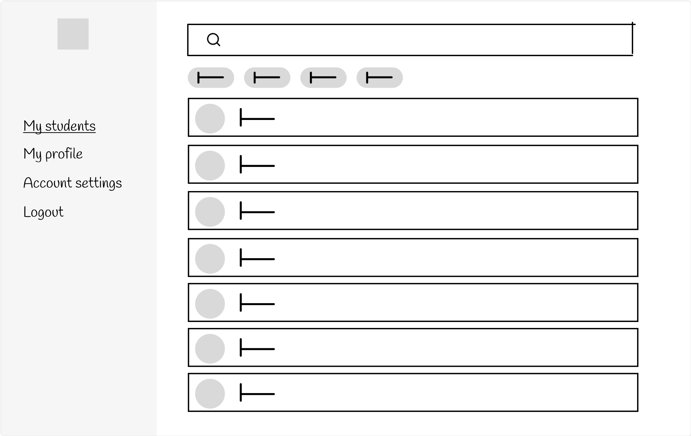

Wireframes
I built out a full wireframe prototype of the student management system with four unique flows to capture each user type’s experience. This stage helped me formalise user permissions based on user type, and allowed me to test functionality, clarify information architecture, and solidify user flows.
Branding
The client wanted a product that felt modern, clean and trustworthy. For this, I utilised a vibrant primary and secondary colour, while incorporating a lot of white space to let the content breathe and be digestible. I used cards to help break up content, and a font that is friendly yet professional.

High fidelity prototype
I designed a full high fidelity prototype that drew upon learnings from my wireframe testing sessions, and branding presentation feedback. I limited my colours to interactive elements and informative graphics to help the user understand and digest the content as easily as possible. I tested this prototype with users and presented it to the client to ensure our different user types are able to complete the actions they need to, in a delightful, intuitive way.

